Graphic Design Principles: The Ultimate Powerful Guide
Introduction: Why Graphic Design Principles Matter
Graphic design principles are the invisible rules that separate stunning visuals from forgettable ones. Whether you are a beginner stepping into the creative world or a seasoned designer looking to sharpen your skills, understanding these foundational principles is absolutely essential. Great design is not just about making things look pretty – it is about strategic visual communication that connects with people.
From logos and websites to social media posts and packaging, graphic design principles guide every decision a designer makes. They are the backbone of every successful brand identity, every viral infographic, and every memorable advertisement you have ever seen.
In this comprehensive guide, we will walk you through the core graphic design principles you need to master in 2025. We will also cover the advantages, disadvantages, tips, tricks, image guidelines, and even a ready-to-use LinkedIn caption – so you have everything you need in one place.
Pro Insight: According to Adobe’s 2024 Design Trends Report, businesses that invest in good design outperform their competitors by up to 219% over a decade. Graphic design principles are not just aesthetic choices – they are business tools. |
What Are Graphic Design Principles?
Graphic design principles are a set of visual guidelines and rules that designers use to create effective, balanced, and purposeful compositions. They are derived from decades of study in art, psychology, and human perception. These principles help designers make intentional decisions about how elements – shapes, colors, text, images – are arranged within a layout.
Think of them as the grammar of visual language. Just as you need grammar to write a sentence people can understand, you need design principles to create visuals that communicate clearly and powerfully.
External Resource: For a deeper academic understanding of visual design theory, visit the Interaction Design Foundation (ixdf.org) — one of the world’s largest UX and design learning communities. |
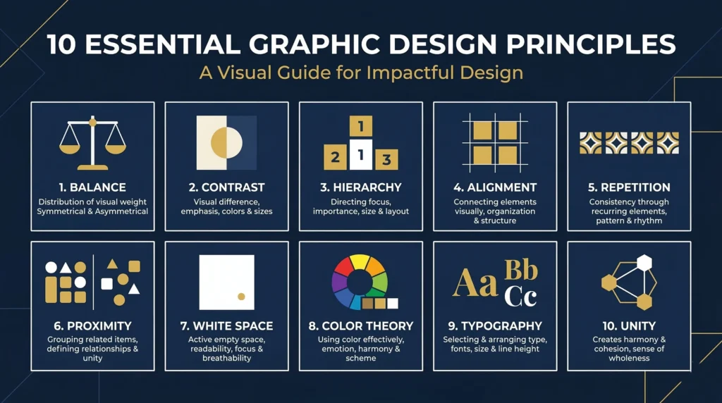
The 10 Core Graphic Design Principles You Must Know
1. Balance — Creating Visual Stability

Balance is one of the most fundamental graphic design principles. It refers to the equal distribution of visual weight within a composition. There are three main types of balance:
- Symmetrical Balance: Elements are mirrored on both sides of a central axis. It conveys formality and stability. Think of luxury brand logos.
- Asymmetrical Balance: Different elements are used on each side, but their visual weight is equal. It feels modern, dynamic, and energetic.
- Radial Balance: Elements radiate outward from a central point, like a sunburst or a clock.
A well-balanced design feels natural and comfortable. An unbalanced design feels chaotic and hard to look at. Balance guides the viewer’s eye and prevents any one element from overpowering the rest.
2. Contrast — Making Elements Stand Out
Contrast is arguably the most powerful of all graphic design principles. It means placing opposite or different elements next to each other – light vs. dark, large vs. small, warm vs. cool. Strong contrast creates focus, draws attention, and makes important information pop.
Without contrast, a design looks flat and monotonous. With the right contrast, a design becomes dynamic and easy to navigate. Every call-to-action button, headline, and hero image relies on contrast to do its job effectively.
3. Visual Hierarchy — Guiding the Viewer’s Eye
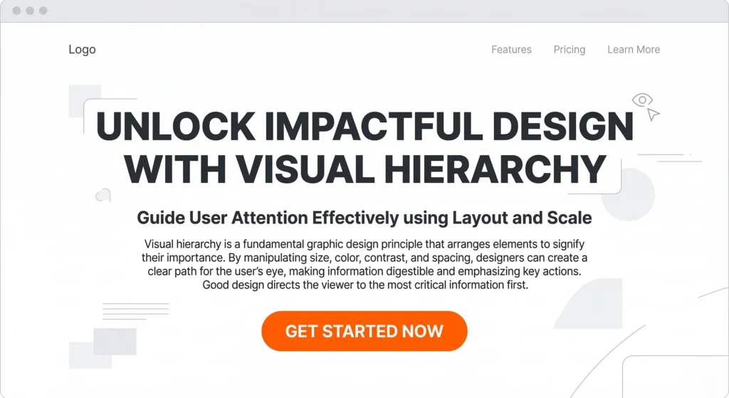
Visual hierarchy is the principle of organizing elements so that the most important information is noticed first. It is one of the most critical graphic design principles in UX and web design. You establish hierarchy through size, color, placement, weight, and spacing.
Headlines are larger than body text. Primary CTAs are brighter than secondary ones. The designer controls what the viewer sees first, second, and third – subtly guiding them through the content without them even realizing it.
4. Alignment — Creating Order and Professionalism
Alignment refers to lining up design elements along a common axis – horizontal, vertical, or centered. Proper alignment creates a visual connection between elements, makes layouts look clean and organized, and communicates professionalism. Misaligned design feels sloppy and untrustworthy.
Even a few pixels of misalignment can undermine an otherwise beautiful design. Grid systems are a designer’s best friend when it comes to maintaining consistent alignment across a layout.
5. Repetition — Building Consistency and Brand Identity
Repetition means consistently using the same design elements – colors, fonts, shapes, icons, patterns – throughout a piece or across a brand. It creates unity, strengthens brand recognition, and makes designs feel intentional and cohesive.
Think about how Nike always uses the Swoosh in a consistent way, or how Apple’s minimalist aesthetic appears across every product and ad. That consistency is the power of repetition in graphic design principles at work.
6. Proximity — Grouping Related Elements
Proximity is the principle of placing related items close together to signal their relationship. Items that are near each other are perceived as part of the same group. Proper use of proximity reduces visual clutter, improves readability, and helps users quickly understand information architecture.
For example, a contact form with labels placed directly above each input field uses proximity to create a clear, intuitive experience.
7. White Space (Negative Space) — Letting Your Design Breathe
White space, also called negative space, is the empty area between and around design elements. Contrary to what beginners often think, white space is not wasted space – it is one of the most sophisticated graphic design principles.
White space reduces cognitive load, improves readability, creates elegance, and draws attention to what matters most. Luxury brands like Chanel and Apple use generous white space deliberately to communicate quality and exclusivity.
8. Color Theory — Communicating Emotion and Meaning
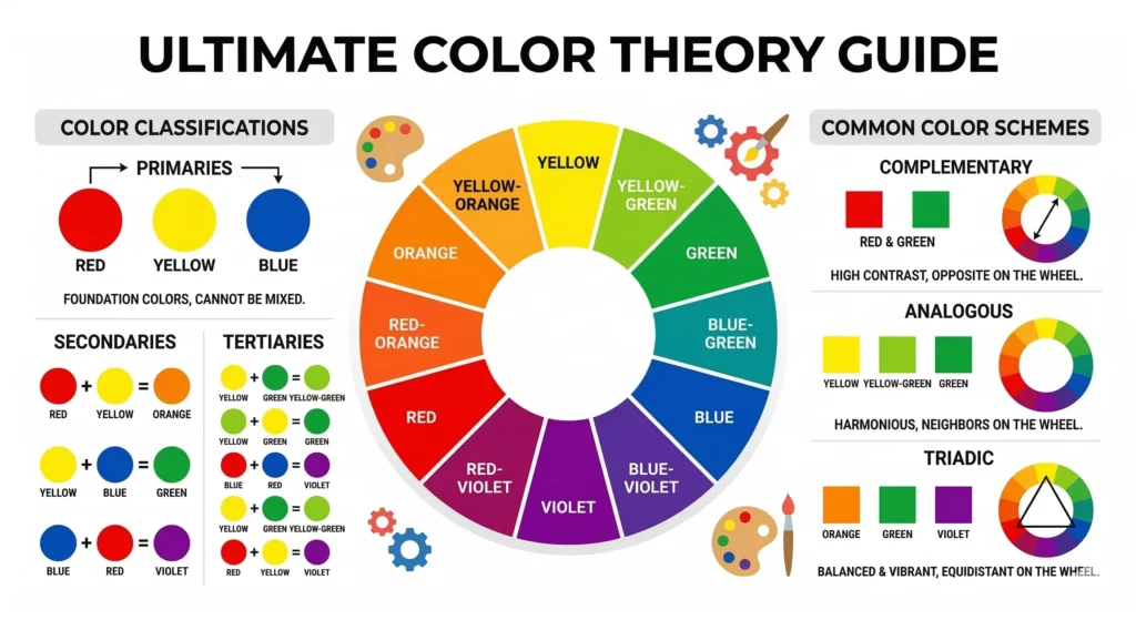
Color is one of the most emotionally powerful tools in a designer’s toolkit. Understanding color theory — including hue, saturation, value, complementary colors, and color psychology — is essential for any designer. Different colors evoke different emotions:
- Blue: Trust, calm, professionalism (used by banks and tech companies)
- Red: Energy, urgency, passion (used by food brands and sale announcements)
- Green: Nature, health, growth (used by eco and wellness brands)
- Yellow: Optimism, warmth, creativity (used by youth-focused brands)
Choosing the right color palette is a strategic decision rooted in graphic design principles and brand psychology.
9. Typography — The Art of Type
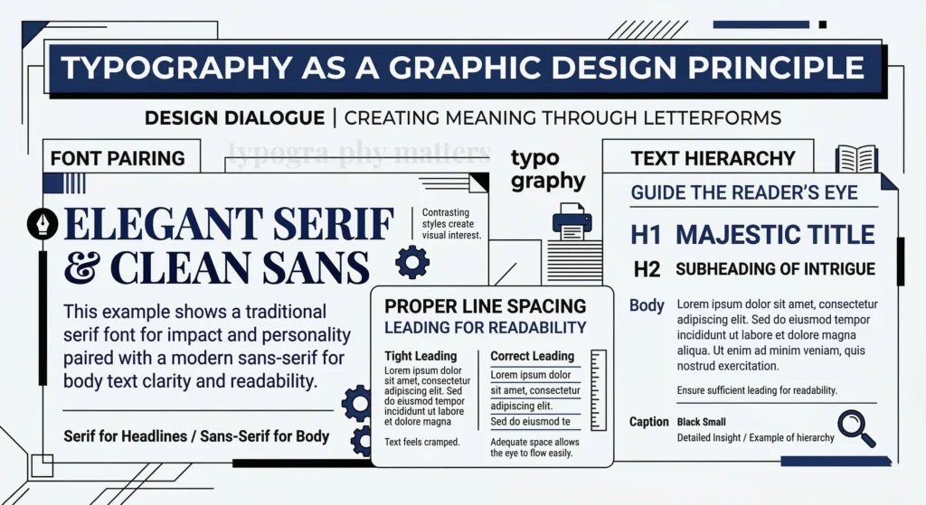
Typography is much more than choosing a font. It involves font pairing, sizing, line height, letter spacing, and hierarchy. Good typography makes text more readable and sets the emotional tone of a design. Poor typography, on the other hand, can completely ruin an otherwise great layout.
Key typographic graphic design principles include: limiting yourself to 2-3 typefaces per project, using hierarchy to differentiate headings and body text, and ensuring adequate line spacing (1.5x the font size is a good baseline) for readability.
10. Unity and Variety — The Perfect Balance
Unity ensures all elements in a design feel like they belong together – through consistent use of color, style, and layout. Variety introduces enough difference to keep things visually interesting and prevent monotony. The best designs achieve a harmonious balance between unity and variety, feeling both cohesive and engaging.
Remember: Mastering all 10 of these graphic design principles does not happen overnight. Practice deliberately, study great designs, and analyze what makes them work. |
Advantages of Applying Graphic Design Principles
✅ Key Advantages |
|
Disadvantages and Common Challenges
⚠️ Common Challenges |
|
Pro Tips and Tricks for Mastering Graphic Design Principles
◆ Design Smarter, Not Harder
- Use a Grid System: Always design on a grid. It enforces alignment and makes spacing decisions easier and more consistent.
- The Rule of Thirds: Borrow from photography – divide your canvas into a 3×3 grid and place key elements at the intersections.
- Test Contrast with Grayscale: Convert your design to grayscale to quickly spot contrast issues before adding color back.
- Limit Your Font Palette: Stick to a maximum of two or three typefaces per project. Use weight and size to create hierarchy.
- Study Great Designs: Spend 15 minutes every day analyzing ads, websites, and logos you admire. Ask yourself: which graphic design principles are they using?
- Use the 60-30-10 Color Rule: 60% dominant color, 30% secondary, 10% accent. This formula creates visual balance effortlessly.
- Add Breathing Room: When in doubt, add more white space. It will almost always improve your design.
- Seek Feedback Early: Share work-in-progress with peers before finalizing. Fresh eyes catch principle violations that you might miss.
- Use Mockups: Present your designs in realistic mockup templates to see how they look in context.
- Create a Style Guide: Document your design decisions – colors, fonts, spacing – so principles are applied consistently across the project.
How to Apply Graphic Design Principles in Real Projects
Understanding graphic design principles theoretically is one thing, applying them in real-world projects is another. Here is a practical workflow:
- Define Your Purpose: Understand what the design needs to communicate before touching any tools.
- Plan Your Hierarchy: Decide which information is most important and use size, weight, and color to prioritize it.
- Set Up a Grid: Build your layout on a grid system before adding any content.
- Choose a Color Palette: Apply the 60-30-10 rule and ensure your colors meet accessibility contrast ratios.
- Apply Typography: Select your font pairing and establish a clear typographic hierarchy.
- Review Each Principle: Run through the checklist – balance, contrast, alignment, proximity, white space – one by one.
- Get Feedback and Iterate: Share with peers, gather input, and refine until every principle is working in harmony.
Best Tools to Practice Graphic Design Principles
- Adobe Illustrator & Photoshop: Industry-standard tools for professional designers.
- Figma: The go-to collaborative tool for UI/UX and web design.
- Canva: Perfect for beginners wanting to apply graphic design principles quickly.
- Sketch: Popular for macOS users focused on digital interface design.
- Adobe XD: Great for prototyping and UX design.
- Affinity Designer: A powerful, affordable alternative to Adobe Illustrator.
For beginners, starting with Canva and progressing to Figma or Adobe products is a widely recommended path in the design community
Frequently Asked Questions (FAQ)
Q: What are the most important graphic design principles for beginners?
A: For beginners, the most critical graphic design principles to learn first are contrast, alignment, hierarchy, and white space. These four principles immediately improve the quality and clarity of any design, even before mastering more advanced concepts like color theory and typography.
Q: How many graphic design principles are there?
A: While different sources list varying numbers, most design authorities agree on 10 core graphic design principles: balance, contrast, hierarchy, alignment, repetition, proximity, white space, color theory, typography, and unity and variety. All of these work together to create effective visual communication.
Q: Can I break graphic design principles?
A: Yes – but only once you thoroughly understand them. Breaking rules deliberately, with intention and skill, can create memorable and impactful designs. However, breaking them out of ignorance simply results in poor design. As Pablo Picasso said: Learn the rules like a pro, so you can break them like an artist.
Q: How do graphic design principles relate to UX design?
A: Graphic design principles are foundational to UX design. Principles like hierarchy, proximity, and alignment directly shape how users navigate and interact with interfaces. A UX designer who understands graphic design principles creates more intuitive and user-friendly digital products.
Q: How long does it take to master graphic design principles?
A: With consistent practice and study, most designers develop a solid command of graphic design principles within 6 to 12 months. Mastery, however, is an ongoing journey – even seasoned professionals continue refining their understanding of these principles throughout their careers.
Q: Are graphic design principles the same as design elements?
A: No. Design elements (line, shape, color, texture, space, form, value) are the building blocks of design – the ‘what.’ Graphic design principles (balance, contrast, hierarchy, etc.) are the rules for how those elements should be arranged – the ‘how.’ Both work together to create effective visual communication.
Q: Do graphic design principles apply to digital and print design?
A: Absolutely. Graphic design principles are universal and apply to all formats – web design, mobile apps, print materials, packaging, signage, social media graphics, and more. The principles remain constant even as the medium and tools change.
Conclusion: Start Applying Graphic Design Principles Today
Graphic design principles are not just abstract theory – they are the practical tools that transform good ideas into great visuals. Whether you are designing a logo, a website, a poster, or a social media post, these principles guide every decision you make.
From the foundational balance and contrast to the nuanced interplay of unity and variety, mastering graphic design principles unlocks your ability to communicate visually with clarity, power, and intention. The designers who invest in understanding these principles consistently produce work that resonates, converts, and endures.
Start small. Pick one graphic design principle this week – maybe contrast or white space and apply it deliberately in every design you create. Then add another principle next week. Compound this habit over months, and you will be amazed at how dramatically your design skills improve.
Bookmark this guide and share it with a fellow designer. Mastering graphic design principles is a journey best taken together. |
One Response