🎨 COLOR THEORY: The Ultimate Guide to Mastering Beautiful Colors
Introduction: Why Color Theory Changes Everything
Color Theory is one of the most powerful yet underestimated tools in a designer’s, artist’s, or marketer’s toolkit. Whether you are designing a logo, painting a canvas, building a website, or choosing an outfit understanding color theory can transform the way you see and use color forever.
Have you ever wondered why certain brands use specific colors? Or why some websites feel calm while others feel energetic? The answer lies in color theory.
In this ultimate guide, we will break down everything you need to know about color theory from its rich history and the science of the color wheel to color harmonies, psychology, and actionable tips every creative professional must know.
Let us dive deep into the colorful world of color theory. 🎨
🔗 Related Read: Graphic Design Principles: The Ultimate Powerful Guide
🔗 External Resource: Adobe Color Wheel Tool
What Is Color Theory?
Color theory is a framework of principles and guidelines that explains how colors relate to one another and how they can be combined to create visually appealing designs. It is both a science and an art — rooted in the physics of light and deeply connected to human perception and emotion.
At its core, color theory answers three essential questions:
- What colors exist? (The color spectrum)
- How do colors relate? (The color wheel)
- How do colors interact? (Harmony, contrast, and emotion)
Color theory is used by graphic designers, interior decorators, fashion designers, filmmakers, marketers, and fine artists every single day.
A Brief History of Color Theory
Understanding color theory begins with its fascinating history.
Isaac Newton (1666): The foundation of modern color theory was laid when Newton passed white light through a prism and revealed the visible spectrum — red, orange, yellow, green, blue, indigo, and violet. He then arranged these colors into the first circular color diagram, giving birth to the color wheel.
Johann Wolfgang von Goethe (1810): Goethe challenged Newton’s purely scientific approach and introduced the psychological dimension of color theory in his book Theory of Colors. He explored how colors affect human emotions — a concept central to modern design.
Johannes Itten (1961): Itten, a Bauhaus professor, developed one of the most influential frameworks in color theory. His work on color contrasts and harmonies remains a reference point for artists and designers today.
Josef Albers (1963): His book Interaction of Color showed how colors change appearance depending on surrounding colors — a revolutionary concept in practical color theory.
Today, color theory continues to evolve in digital design, branding, and UX/UI development.
🔗 External Resource: Goethe’s Theory of Colors – Historical Overview
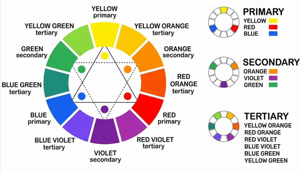
The Color Wheel: The Heart of Color Theory
The color wheel is the most essential tool in color theory. It visually organizes colors in a circular format so you can understand how they relate to each other.
Primary Colors
In traditional color theory, the three primary colors are:
- 🔴 Red
- 🔵 Blue
- 🟡 Yellow
These colors cannot be created by mixing other colors. They are the foundation of all other colors in the color theory spectrum.
In digital color theory (light-based), the primary colors are Red, Green, and Blue (RGB).
Secondary Colors
Secondary colors are formed by mixing two primary colors:
- 🟠 Orange = Red + Yellow
- 🟢 Green = Blue + Yellow
- 🟣 Purple/Violet = Red + Blue
Tertiary Colors
Tertiary colors are the result of mixing a primary with an adjacent secondary color — giving us shades like red-orange, yellow-green, blue-violet, and more. These six colors, combined with primary and secondary colors, complete the 12-color wheel that is central to color theory.
Color Properties: Hue, Saturation & Value
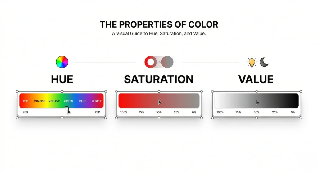
A thorough understanding of color theory requires knowing the three core properties of color:
1. Hue
Hue is simply the name of the color – red, blue, yellow, green, etc. It is what we refer to when we say “that is a blue chair.” In color theory, hue is the pure, unmixed version of a color.
2. Saturation
Saturation refers to the intensity or purity of a color. A highly saturated color is vivid and bold; a desaturated color appears more muted or grayish. In color theory, saturation controls how vibrant or washed-out a color appears.
3. Value (Brightness)
Value describes how light or dark a color is. Adding white to a color creates a tint, adding black creates a shade, and adding gray creates a tone. Mastering value is critical in color theory for creating depth and contrast.
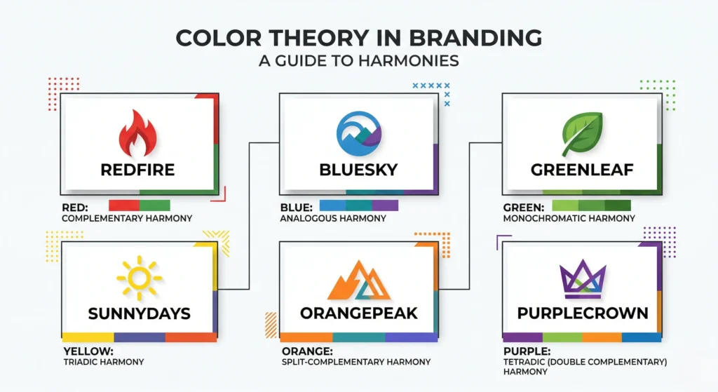
Color Harmonies: The Rules of Beautiful Combinations
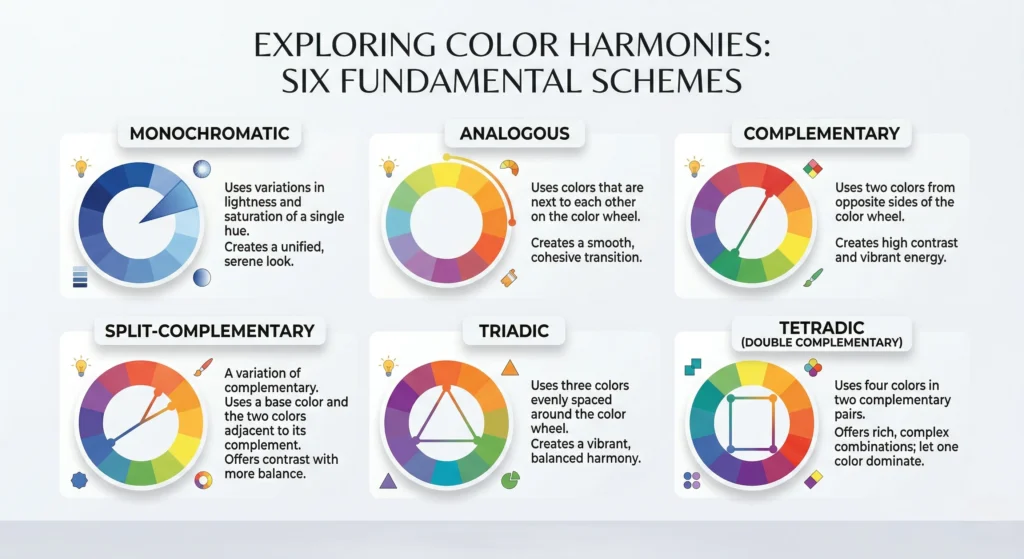
Color harmony is where color theory becomes truly practical. These are proven formulas for combining colors in ways that are pleasing to the eye.
1. Complementary Colors
Complementary colors sit directly opposite each other on the color wheel (e.g., blue and orange, red and green). This pairing creates maximum contrast and visual energy. Used frequently in logos and sports branding, complementary harmony is one of the boldest moves in color theory.
2. Analogous Colors
Analogous colors are three or more colors that sit next to each other on the color wheel (e.g., yellow, yellow-green, green). They create a harmonious, soothing feel – perfect for nature-inspired designs. This is one of the gentlest applications of color theory.
3. Triadic Colors
Triadic harmony uses three colors equally spaced on the color wheel (e.g., red, yellow, blue). It creates a vibrant and balanced look — great for playful, energetic designs. In color theory, triadic schemes are bold but balanced.
4. Split-Complementary Colors
A variation of complementary color theory, this scheme uses one base color and two colors adjacent to its complement. It offers high contrast with more nuance than a straight complementary pair.
5. Tetradic (Square/Rectangle) Colors
Tetradic harmony uses four colors arranged in two complementary pairs. It is the richest and most complex of all color theory harmonies – offering tremendous variety but requiring careful balance.
6. Monochromatic Colors
Monochromatic color theory uses one single hue in different tints, shades, and tones. The result is clean, elegant, and sophisticated – frequently used in luxury branding and minimal UI design.
The Psychology of Color: How Colors Make You Feel
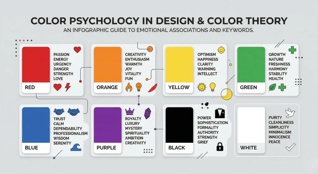
Perhaps the most fascinating aspect of color theory is color psychology – the study of how colors influence human behavior, emotion, and decision-making.
🔴 Red
Red symbolizes passion, energy, urgency, and danger. In color theory, red is used to trigger action – think “Buy Now” buttons, fast food logos, and sale tags. It raises heart rate and creates excitement.
🟠 Orange
Orange combines the energy of red and the warmth of yellow. It communicates enthusiasm, creativity, and warmth. Brands like Amazon and Harley-Davidson leverage orange’s approachable energy in their visual identity.
🟡 Yellow
Yellow represents optimism, clarity, and happiness. In color theory, yellow grabs attention quickly – making it ideal for warnings, children’s products, and brands wanting to project joy.
🟢 Green
Green is the color of nature, health, growth, and balance. Environmental brands, health companies, and financial institutions use green to convey trustworthiness and prosperity.
🔵 Blue
Blue is the world’s most universally liked color. In color theory, blue represents trust, calmness, intelligence, and reliability. It is the dominant color in corporate branding (Facebook, LinkedIn, Samsung, Ford).
🟣 Purple
Purple conveys luxury, creativity, wisdom, and mystery. Historically associated with royalty, purple is used in premium beauty brands, spiritual contexts, and creative industries.
⚫ Black
Black communicates sophistication, authority, elegance, and power. In color theory, black is the most versatile neutral – used in luxury fashion, tech branding, and editorial design.
⚪ White
White represents purity, cleanliness, simplicity, and space. In digital design, white space is a powerful color theory tool that improves readability and creates a sense of premium quality.
Color Theory in Design: Practical Applications
Color theory is not just academic – it is deeply practical. Here is how professionals apply it:
Web & UI Design
Color theory guides the entire visual hierarchy of a website. Primary call-to-action buttons use high-contrast complementary colors. Background colors set the emotional tone. Typography colors ensure readability.
Branding & Logo Design
Every major brand uses color theory deliberately. Coca-Cola’s red triggers excitement. Starbucks’ green signals freshness. Apple’s white minimalism suggests innovation. Color theory is at the core of all brand identity systems.
Interior Design
Interior designers use color theory to influence how people feel in a space. Warm colors (reds, oranges, yellows) make rooms feel cozy. Cool colors (blues, greens) create calm and spaciousness.
Fashion Design
Fashion leverages color theory for seasonal palettes, outfit coordination, and brand identity. Understanding complementary and analogous harmonies helps stylists and designers create cohesive collections.
Photography & Film
Cinematographers apply color theory in color grading to set emotional tones. Warm golden grades signal nostalgia; cool blue-green tones signal tension or melancholy.
✅ Advantages of Understanding Color Theory
- Better Design Decisions — Color theory eliminates guesswork by giving you a scientific and artistic framework for color choices.
- Stronger Brand Identity — Brands that apply color theory consistently build stronger visual recognition.
- Improved User Experience — In UI/UX, color theory helps create intuitive, accessible interfaces.
- Emotional Communication — Color theory allows you to intentionally trigger emotions and guide audience behavior.
- Professional Credibility — Designers fluent in color theory produce polished, professional work that stands out.
- Universal Language — Color theory transcends language barriers — colors communicate globally.
- Increased Conversion Rates — Businesses that apply color theory in marketing see measurable improvements in engagement and sales.
❌ Disadvantages of Color Theory
- Cultural Differences — Colors carry different meanings across cultures. White means mourning in some Asian cultures, while it means purity in Western color theory traditions. Always research your audience.
- Oversimplification Risk — Rigidly following color theory rules can stifle creativity. Great design sometimes breaks the rules.
- Accessibility Challenges — Standard color theory does not always account for color blindness. Around 8% of men are color blind, requiring designers to test beyond traditional color theory palettes.
- Digital vs. Print Differences — RGB (screen) and CMYK (print) behave differently. Color theory must be adapted for the medium.
- Subjectivity — Despite its scientific roots, color perception is highly subjective. What works beautifully in one context may fail in another.
💡 Tips & Tricks: Mastering Color Theory Like a Pro
1. Start With the 60-30-10 Rule A classic interior and graphic design rule: use 60% of a dominant color, 30% of a secondary color, and 10% as an accent. This color theory principle creates effortless balance.
2. Use the Color Wheel Daily Bookmark Adobe Color and explore harmonies every day. Practicing with a real color wheel builds your color theory intuition fast.
3. Study Brand Color Palettes Analyze the color palettes of brands you admire. Ask yourself: What color theory principles are they using? What emotions are they triggering?
4. Always Test for Accessibility Use tools like Contrast Checker by WebAIM to ensure your color theory choices meet WCAG accessibility standards (minimum 4.5:1 contrast ratio for text).
5. Limit Your Palette Beginners in color theory often over-complicate palettes. Stick to 2–4 colors maximum. Constraints force creativity.
6. Understand Warm vs. Cool Colors Warm colors (red, orange, yellow) advance visually and feel energetic. Cool colors (blue, green, purple) recede and feel calm. Use this color theory principle to control visual weight.
7. Use Tints and Shades for Depth You don’t always need multiple hues. A monochromatic color theory approach using tints and shades of one color creates sophisticated, cohesive designs.
8. Context Is Everything The same color can mean completely different things depending on context, culture, and surrounding colors. Never apply color theory rules in isolation — always consider the full visual environment.
9. Create Mood Boards First Before finalizing any palette, create a mood board to see how your color theory choices work together visually and emotionally.
10. Photograph Colors in Different Lighting Natural light, artificial light, and screen calibration all affect how colors appear. Test your color theory palettes across multiple environments.
❓ FAQ: Color Theory
Q1. What is Color Theory in simple terms? Color Theory is a set of principles that explains how colors work – how they’re created, how they relate to each other on the color wheel, how they can be combined harmoniously, and how they affect human emotion and perception.
Q2. Why is Color Theory important for designers? Color theory is essential for designers because it provides a systematic approach to making color choices that are visually appealing, emotionally resonant, and effective in communication. Without color theory, design decisions become random and unpredictable.
Q3. What are the three primary colors in Color Theory? In traditional color theory, the three primary colors are Red, Blue, and Yellow. In digital/light-based color theory (RGB), they are Red, Green, and Blue.
Q4. What is the difference between a tint, shade, and tone in Color Theory? In color theory: a tint is a color mixed with white (making it lighter), a shade is a color mixed with black (making it darker), and a tone is a color mixed with gray (making it more muted).
Q5. How does Color Theory apply to web design? In web design, color theory guides choices about background colors, typography, button colors, and visual hierarchy. It ensures the website triggers the right emotions, maintains brand consistency, and provides an accessible, user-friendly experience.
Q6. What is the best color combination for a professional brand? There is no single “best” combination – it depends on brand values and audience. However, color theory suggests that complementary colors create high-impact contrast, while analogous schemes feel approachable and harmonious. Blue-based palettes are popular for corporate trust.
Q7. Does Color Theory apply to photography? Absolutely. Photographers and cinematographers use color theory in composition (using complementary colors for impact) and post-production color grading (using warm or cool tones to set the emotional mood of an image).
Q8. Can I break the rules of Color Theory? Yes – in fact, the best creatives know the rules before they break them. Color theory is a guide, not a law. Once you master the fundamentals, rule-breaking becomes a powerful creative tool.
Conclusion: Your Journey With Color Theory Starts Now
Color theory is not just for artists or professional designers. It is a universal visual language that everyone – from bloggers and entrepreneurs to photographers and marketers – can use to communicate more powerfully and create more beautifully.
By understanding the color wheel, harmonies, properties, and psychology, you now have the foundation to make every color choice with intention and confidence.
Start applying color theory today: pick up a color wheel, explore Adobe Color, analyze the palettes of brands you love, and experiment freely. The more you practice, the more natural it becomes.
Remember: every great design, every iconic brand, every breathtaking artwork begins with a deep understanding of color theory.