RGB and CMYK: The Complete Difference Guide Every Designer Must Know
When you design a stunning logo on your screen and send it to the printer, only to receive something that looks completely washed out – you’ve just experienced what happens when you ignore the difference between RGB and CMYK. Understanding these two color models isn’t just a technical checkbox; it’s the foundation of professional, consistent, and beautiful design work.
Whether you’re a beginner stepping into graphic design or a seasoned creative brushing up on fundamentals, this complete guide will walk you through everything you need to know about RGB and CMYK – what they are, how they work, when to use each, and the pro tips that will save your designs from costly mistakes.
What is RGB?
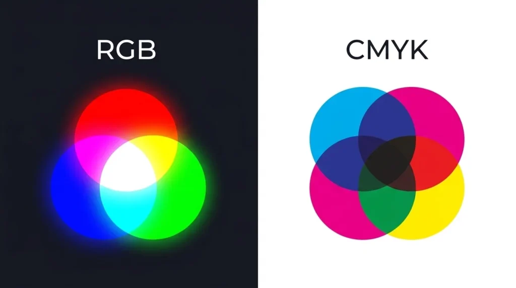
RGB stands for Red, Green, and Blue. It is an additive color model, meaning colors are created by adding light together. When all three colors (Red, Green, and Blue) are combined at full intensity, they produce white light. When all three are absent, the result is black (darkness).
The RGB and CMYK color systems exist because of a fundamental difference in how light and ink behave in the physical world. RGB is the language of light-emitting devices – monitors, TVs, smartphones, tablets, digital cameras, and projectors all speak RGB.
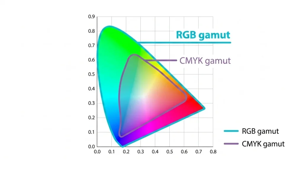
Each channel in RGB has a value ranging from 0 to 255, giving you a total of over 16.7 million possible colors. This massive color range – also called a color gamut – makes RGB perfect for vivid, vibrant digital visuals.
💡 Quick Fact: Your screen is made of millions of tiny pixels, each containing red, green, and blue light sources. Adjusting their intensity creates every color you see.
RGB Values of Common Colors:
| Color | R | G | B |
|---|---|---|---|
| White | 255 | 255 | 255 |
| Black | 0 | 0 | 0 |
| Red | 255 | 0 | 0 |
| Blue | 0 | 0 | 255 |
| Green | 0 | 128 | 0 |
| Yellow | 255 | 255 | 0 |
What is CMYK?
CMYK stands for Cyan, Magenta, Yellow, and Key (Black). Unlike RGB, CMYK is a subtractive color model. Instead of adding light, it works by subtracting (absorbing) light from a white surface (paper). Each ink layer absorbs certain wavelengths of light and reflects others, creating the colors you see.
The “K” in CMYK stands for Key, which represents black ink. Although theoretically, combining Cyan, Magenta, and Yellow at 100% should produce black – in practice, it creates a muddy dark brown. That’s why black ink is added separately for sharp, clean text and deep shadows.
In the debate of RGB and CMYK, CMYK is the undisputed king of physical print production. Magazines, brochures, business cards, packaging, posters, and newspapers are all printed using CMYK inks.
Each CMYK channel is expressed as a percentage from 0% to 100%, representing how much of each ink is used.
CMYK Values of Common Colors:
| Color | C | M | Y | K |
|---|---|---|---|---|
| White | 0% | 0% | 0% | 0% |
| Black | 0% | 0% | 0% | 100% |
| Red | 0% | 100% | 100% | 0% |
| Blue | 100% | 100% | 0% | 0% |
| Yellow | 0% | 0% | 100% | 0% |
| Green | 100% | 0% | 100% | 0% |
The Core Difference Between RGB and CMYK
The single most important thing to understand about RGB and CMYK is this: they exist in two different worlds. RGB lives in digital light. CMYK lives in physical ink.
Here’s a breakdown of their core differences:
🔴 Color Formation
- RGB adds light together (additive). More light = brighter color.
- CMYK absorbs light through ink layers (subtractive). More ink = darker color.
🎨 Color Gamut (Range)
- RGB has a much wider color gamut. It can reproduce colors that CMYK simply cannot – especially ultra-bright neons, vivid oranges, and electric blues.
- CMYK has a narrower range. Many RGB colors “fall out of gamut” when converted to CMYK, meaning they must be approximated.
📺 Medium
- RGB is for screens, monitors, digital displays, websites, apps, and video.
- CMYK is for printed materials – business cards, flyers, books, packaging, and more.
🖨️ Output
- RGB files are displayed using backlit screens.
- CMYK files are output onto physical surfaces using ink or toner.
📂 File Formats
- RGB is commonly associated with JPG, PNG, GIF, WebP, and PSD (screen-use).
- CMYK is used in PDF, EPS, AI, and TIFF files (print-ready formats).
RGB vs CMYK: Side-by-Side Comparison
| Feature | RGB | CMYK |
|---|---|---|
| Full Name | Red, Green, Blue | Cyan, Magenta, Yellow, Key (Black) |
| Color Model Type | Additive | Subtractive |
| Used For | Screens & Digital | Print & Physical Media |
| Color Range (Gamut) | Wider (16.7M+ colors) | Narrower |
| Base / Background | Black (no light) | White (paper/surface) |
| Value Range | 0–255 per channel | 0–100% per channel |
| File Formats | PNG, JPG, GIF, WebP | PDF, EPS, AI, TIFF |
| Tools | Photoshop, Figma, Canva | Illustrator, InDesign, CorelDRAW |
| Neon/Vivid Colors | ✅ Supported | ❌ Limited |
| Cost of Output | Low (digital display) | Higher (ink + printing) |
When to Use RGB and When to Use CMYK
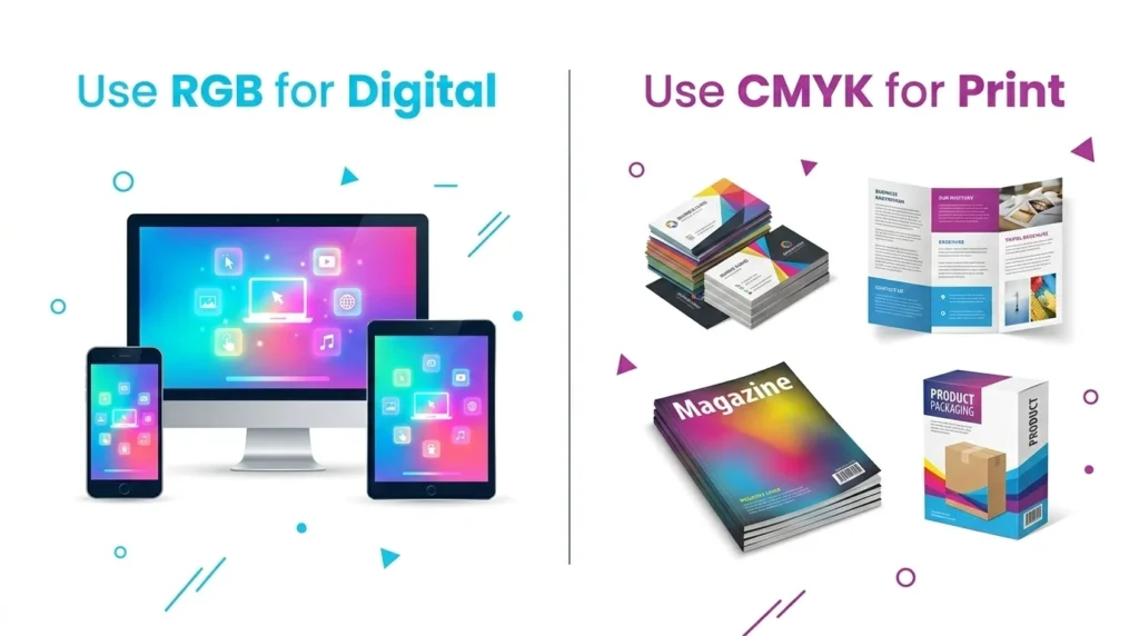
Understanding when to apply each color model is what separates amateur designers from professionals. When it comes to RGB and CMYK, context is everything.
✅ Use RGB When:
- Designing websites, landing pages, and web apps
- Creating social media graphics (Instagram, Facebook, LinkedIn banners)
- Making YouTube thumbnails or digital advertisements
- Working on UI/UX design for apps or software interfaces
- Editing photos for digital publication
- Creating presentations (PowerPoint, Google Slides, Keynote)
- Designing email newsletters
- Producing video content or animations
✅ Use CMYK When:
- Designing business cards, letterheads, and stationery
- Creating flyers, brochures, and pamphlets
- Designing product packaging and labels
- Working on magazine layouts and editorial design
- Producing billboards and large-format print
- Preparing book covers and interior pages
- Designing merchandise like T-shirts and mugs (sublimation-based)
- Submitting files to professional print houses
🚨 Pro Rule: Always start your project in the correct color mode before you begin designing. Switching midway can cause unexpected color shifts.
Advantages and Disadvantages of RGB
✅ Advantages of RGB
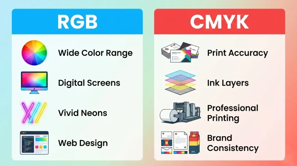
- Wider color gamut — Produces vivid, bright, and neon colors impossible in print
- Perfect for digital output — Every screen-based medium uses RGB natively
- Smaller file sizes — RGB files are generally lighter than CMYK equivalents
- No ink limitations — No need to worry about ink coverage percentages
- Universal compatibility — Web browsers, apps, and OS systems all natively support RGB
- Easier to work with — More intuitive for beginners and digital-first designers
- Vibrant visual impact — Colors appear more luminous and saturated on screen
❌ Disadvantages of RGB
- Not suitable for print — Sending an RGB file to a printer leads to inaccurate colors
- Color shift on conversion — Converting RGB to CMYK often results in duller, muted colors
- Inconsistent across screens — Different monitors display RGB colors differently depending on calibration
- Not print-industry standard — Professional print vendors require CMYK files
- Neon colors can’t be physically reproduced — Some vivid RGB hues have no real-world ink equivalent
Advantages and Disadvantages of CMYK
✅ Advantages of CMYK
- Industry standard for print — All professional printers and print houses use CMYK
- Accurate physical color reproduction — What you design is close to what you get printed
- Better control over ink density — You can manage total ink coverage to avoid smudging
- Consistent results — CMYK is calibrated for consistent output on paper
- Required for professional output — Prepress workflows and commercial printing demand CMYK
- Supports spot color integration — Works alongside Pantone and spot inks for brand accuracy
❌ Disadvantages of CMYK
- Smaller color gamut — Many bright and neon colors cannot be reproduced in CMYK
- Heavier file sizes — CMYK files (especially TIFF/PDF) tend to be larger
- Not meant for screens — CMYK files look dull and inaccurate when displayed on monitors
- Conversion from RGB causes color loss — Transitioning bright RGB colors to CMYK leads to visible dullness
- Higher production cost — Physical printing with four-color inks is more expensive than digital
- Complexity for beginners — Managing ink percentages and print bleed requires experience
How to Convert RGB to CMYK (and Vice Versa)

One of the most searched topics in the RGB and CMYK discussion is conversion. Here’s how to do it correctly.
🔁 Converting RGB to CMYK in Adobe Photoshop
- Open your file in Adobe Photoshop
- Go to Image → Mode → CMYK Color
- A dialog will warn you about gamut changes — click OK
- Review your image for any color shifts
- Save as TIFF or PDF for print submission
⚠️ Always work on a duplicate before converting. The conversion is destructive and cannot be perfectly undone.
🔁 Converting RGB to CMYK in Adobe Illustrator
- Open your document in Adobe Illustrator
- Go to File → Document Color Mode → CMYK Color
- Check all swatches and relink any out-of-gamut colors
- Export as PDF (Print) using the correct preset
🔁 Converting CMYK to RGB
- In Photoshop: Image → Mode → RGB Color
- Useful when repurposing print files for web/digital use
- The conversion is generally cleaner going CMYK → RGB than the reverse
🌐 Free Online Converters
If you’re not using Adobe tools, several free online tools can help you convert RGB and CMYK values:
- Adobe Color — Free, professional color tool
- RapidTables RGB to CMYK Converter — Quick value conversion
🔗 External Resource: For a deeper understanding of color profiles and ICC standards, visit the International Color Consortium (ICC) official website for authoritative documentation.
Tips and Tricks for Managing Color Modes Like a Pro
Here are the most powerful tips and tricks to master RGB and CMYK in your design workflow:
🎯 Tip 1: Always Set Up Your Document in the Right Mode
Before you draw a single pixel, confirm your document’s color mode. In Photoshop, check Image → Mode. In Illustrator, check File → Document Color Mode. Starting right eliminates problems later.
🎯 Tip 2: Use Soft Proofing in Photoshop
Before converting RGB to CMYK, use View → Proof Colors in Photoshop. This simulates how your RGB design will look when printed in CMYK — without actually changing the file. It’s one of the most underused features in the RGB and CMYK workflow.
🎯 Tip 3: Use Pantone Colors for Brand Accuracy
If your brand colors must be exact across both digital (RGB) and print (CMYK), consider using Pantone Spot Colors. These provide a third reference point that transcends both RGB and CMYK limitations.
🎯 Tip 4: Watch Your Total Ink Coverage
In CMYK, the sum of all four ink values (C+M+Y+K) should generally not exceed 300% for standard commercial printing (some high-end presses go up to 320%). Exceeding this causes slow drying, ink smearing, and paper warp.
🎯 Tip 5: Keep Logos in Vector Format with Both Modes
Your logo should exist as an AI or EPS vector file with CMYK values defined AND a separate version with RGB/HEX values. This ensures perfect output whether it’s printed on a business card or displayed on a website.
🎯 Tip 6: Never Trust Your Monitor for Print Color Decisions
Monitors display RGB light. What looks perfect on screen may look very different in print. Always request a physical proof from your printer before approving a large print run.
🎯 Tip 7: Build a Dual-Mode Color Palette
If you manage a brand, create and maintain a color swatch library that includes RGB values (for digital), CMYK values (for print), HEX codes (for web/CSS), and Pantone codes (for spot color printing). Tools like Coolors.co can help you build and export palettes.
🎯 Tip 8: Use 300 DPI for All Print-Bound CMYK Work
Resolution matters in print. Digital images can look sharp at 72 DPI on screen, but print requires a minimum of 300 DPI at the final output size. Always design at 300 DPI when working in CMYK.
🎯 Tip 9: Add Bleed and Crop Marks to Print Files
When preparing a CMYK print file, always add 3mm bleed on all sides and include crop marks. This ensures no white edges appear when the printed piece is cut to size.
🎯 Tip 10: Test Your Neon Colors Early
If your RGB design uses neon or very saturated colors, run a CMYK soft proof early in the process. Don’t fall in love with a color that simply cannot exist in ink. Adjust early; adjust easily.
Common Mistakes Designers Make with RGB and CMYK
Even experienced designers slip up. Here are the most common RGB and CMYK mistakes to avoid:
- Mistake #1: Designing logos in RGB and sending directly to print — Always convert and verify before sending to a print vendor.
- Mistake #2: Assuming what you see on screen is what you’ll get printed — Screens and paper are fundamentally different media.
- Mistake #3: Using RGB photos in a CMYK InDesign layout — Always embed CMYK-converted images in print layouts.
- Mistake #4: Ignoring out-of-gamut warnings in Photoshop — Those small gray exclamation marks next to color values are warning you about colors that cannot be printed accurately.
- Mistake #5: Converting a file repeatedly — Each conversion introduces color degradation. Convert once, carefully, and save your original.
- Mistake #6: Using “rich black” incorrectly — For large black backgrounds in print, use CMYK rich black (C:60, M:40, Y:40, K:100). For small text, use simple 100K to avoid misregistration.
RGB and CMYK in Popular Design Tools
| Tool | Default Mode | Supports RGB | Supports CMYK |
|---|---|---|---|
| Adobe Photoshop | RGB | ✅ | ✅ |
| Adobe Illustrator | RGB | ✅ | ✅ |
| Adobe InDesign | CMYK | ✅ | ✅ |
| Canva | RGB only | ✅ | ❌ (limited) |
| Figma | RGB | ✅ | ❌ |
| CorelDRAW | RGB/CMYK | ✅ | ✅ |
| Affinity Designer | RGB | ✅ | ✅ |
| GIMP | RGB | ✅ | ❌ (via plugin) |
| Sketch | RGB | ✅ | ❌ |
💡 Note for Canva users: Canva operates exclusively in RGB. If you’re preparing files for professional printing using Canva, request a PDF export and check with your printer for their preferred format. For critical print work, always use industry-standard tools that support CMYK natively.
Real-World Use Cases
Case 1: Brand Identity Design
A startup hires you to design their brand identity. You’ll need both RGB and CMYK. Use RGB for the website, social media, and app UI. Use CMYK for business cards, letterheads, and brochures. Define both values in a brand style guide to ensure consistency across every touchpoint.
Case 2: Photography for a Magazine
A photographer editing images for a fashion magazine must deliver files in CMYK. They should edit in RGB (wider gamut), then soft-proof and convert to CMYK before final delivery, preserving skin tones and fabric colors as accurately as possible.
Case 3: Social Media Campaign
A social media manager creating Instagram carousels and Facebook ads should work entirely in RGB. The vibrant color range of RGB makes digital content pop on users’ screens.
Case 4: Packaging Design
A food brand’s packaging designer works exclusively in CMYK. They carefully manage ink percentages to avoid ink overload on product packaging, which must survive cutting, folding, and handling. Using a color they defined in RGB would be a costly error.
FAQ — Frequently Asked Questions About RGB and CMYK
The main difference between RGB and CMYK is how they create color. RGB uses light (additive color model) for digital screens, while CMYK uses ink (subtractive color model) for physical printing. RGB produces a wider color range, while CMYK is optimized for accurate print reproduction.
Neither is universally “better.” RGB and CMYK each excel in their intended medium. RGB is best for digital screens and web design. CMYK is best for professional printing. The right choice depends entirely on where your design will be displayed or used.
Your printer will automatically convert your RGB file to CMYK during printing. However, this automatic conversion is rarely accurate and often results in colors appearing duller, less vibrant, or noticeably different from what you see on screen. Always convert and review manually before printing.
Technically, you can submit an RGB file to some printers, but it is strongly discouraged for professional work. The printer’s automatic conversion of your RGB and CMYK settings may produce unpredictable results. Use CMYK for any serious print project.
Because RGB’s color gamut is larger than CMYK’s. Many bright, vivid RGB colors (especially neons and electric blues) simply do not have equivalent ink combinations in CMYK. When converting, these out-of-gamut colors are mapped to the nearest printable CMYK value, which is usually less vibrant.
While CMYK mixes four standard inks to create colors, Pantone (also known as PMS — Pantone Matching System) uses a library of pre-mixed, standardized spot inks. Pantone provides the highest color accuracy for brand-critical colors and can reproduce shades (like metallic or neon) that RGB and CMYK cannot achieve together.
As of now, Canva primarily operates in RGB and does not offer native CMYK design mode. For professional print work requiring true CMYK color accuracy, Adobe Illustrator, InDesign, or Affinity Designer are recommended alternatives.
In Adobe Photoshop, go to Image → Mode — it will show either “RGB Color” or “CMYK Color.” In Adobe Illustrator, check File → Document Color Mode. In InDesign, check Edit → Color Settings and the swatches panel.
The “K” stands for Key, which refers to the black ink plate. Black is called the “key” plate because it carries the most detail (text, lines, shadows) and is used as the reference key against which the other three color plates (C, M, Y) are aligned during printing.
You should maintain both versions of your logo — one in RGB (for digital/web use) and one in CMYK (for print use). Ideally, your logo should be a vector file (AI or EPS) that contains both color definitions, making it easy to switch between RGB and CMYK depending on the output requirement.
Conclusion
The difference between RGB and CMYK is more than a technical detail – it’s a fundamental design decision that affects how your work looks in the real world. RGB powers every pixel on every screen, delivering rich, vibrant, light-based color. CMYK controls every ink drop on every printed page, delivering consistent, reproducible physical color.
As a designer, developer, photographer, or marketer, mastering the distinction between RGB and CMYK means your designs will look exactly the way you intended – whether someone is viewing them on a phone, a laptop, or holding a business card in their hands.
Start every project with the right color mode, always soft-proof before printing, build dual-mode brand color palettes, and never assume what you see on screen will translate perfectly to print. Do these things, and the RGB and CMYK challenge will never catch you off guard again.